 |
Simon Yu |
A well organized web site will increase it's usability resulting in your visitors staying on your site longer and coming back more frequently. The main page of a site is referred to as the home or index page. On this page there should be navigation linking to each of the major subpages of the site. These navigation links can be either text links or image buttons. The author divide the site into three levels. The five links on the site should appear on each of the eight pages of the site. In this way a visitor should be able to easily figure out exactly where on the site they are. To maintain a consistent look and feel throughout the site, the same overall design should be used on each page. For example, if each of the five main navigation links were made from buttons shaped like hats, and they were lined up along a left column, they should be that way on each page of the site. It is however, a good idea to include plain text links to each of the main pages on the bottom of each page of the site. This is especially important if the other links are made from graphics. There are people who use browsers with either no graphics capability, or they have them turned off. They will need a way to navigate through your site also. It has also been stated that it should not take more than three clicks to get from one page to any other page on the same web site, and if it does, the site just isn't organized well.

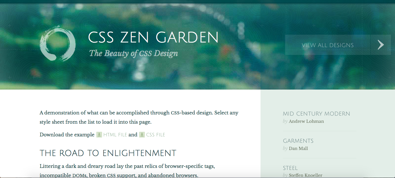
I like this template which is very clear, well-organized and beautiful. It seems to be special to me because of its choices of colors and shapes. Each area on the site has its own color, making the sections very distinguishable. Moreover, the colors among the sections are also very harmonious and peaceful. And the shapes of the sections are right angles, delivering the message of the simplicity. And the buttons are also very big and smooth. Besides, the site also has a beautiful banner. It blurs the image behind, making the theme of the whole site soft and smooth, also enhancing the content in the sections down below. If I am going to make a website, simplicity and color are very important elements of the design. Good colors make people feel happy and relaxed while going through the site. And the simplicity enhances the contents of the site, keeping the readers from distractions.